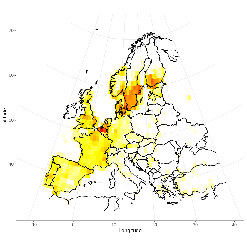
In a previous post, I discussed how to plot GBIF occurrence data using OpenStreetMaps. Here, I will plot a distribution map. Distribution maps differ from occurrence maps in that occurrences are aggregated and plotted as a heat map. Additionally, the map has to be projected using an equal area projection.
I will illustrate these two features by plotting the distribution of the tawny owl (Strix aluco) in Europe.

These are the libraries I will be using:
library(ggplot2)
library(maps)
library(readr)
library(dplyr)
I will be plotting a map of Europe. After some trial and error, I settled for these coordinates for the map area:
LAT1 = 72 ; LAT2 = 34
LON1 = -12 ; LON2 = 40
I downloaded data from GBIF. I prefer to use the GBIF web interface to search for data and then to download the data as a zip file. I proceeded as explained in this post, and I stored the data in the file “data/GBIF_Strix.zip”.
The data can then be loaded into a variable, and cleaned:
occurrences <- read_tsv("data//GBIF_Strix.zip")
occurrences <- occurrences[
  !is.na(occurrences$decimalLatitude) &
  !is.na(occurrences$decimalLongitude), ]
As this data set has more than 500.000 entries, I will sub-sample 50.000 to speed things up:
occurrences.sampled <-
  occurrences[sample(nrow(occurrences), 50000),]
I aggregated the raw occurrence data into bins of one degree (for simplicity), and used the library dplyr to count the number of occurrences in each bin:
occurrences.sampled$x =
  round(occurrences.sampled$decimalLongitude)
occurrences.sampled$y =
  round(occurrences.sampled$decimalLatitude)
strix.dist <- occurrences.sampled %>%
  group_by(x,y) %>%
  tally()
A line map of the world is available through the maps library:
world_df <- map_data("world")
The data can now be plotted using geom_tile (note that I plotted the log transformed counts), and the map using geom_path:
map <- ggplot(strix.dist) +
  geom_tile(aes(x, y, fill=log(n))) +
  geom_path(aes(x = long, y = lat, group=group),
    data = world_df) +
  xlim(c(LON1, LON2)) + ylim(c(LAT2, LAT1)) +
  theme_bw() +
  labs(x="Longitude", y="Latitude")
This map has two problems:
- the default color scale is too dark
- the areas of the tiles are not equal, as the map is distorted towards the north
To correct the first problem, I added a more suitable color scale, and removed the legend, as I am plotting log transformed counts:
scale <- scale_fill_gradientn(
  colors=c("white", "yellow", "red"),
  guide=FALSE)
To correct the second problem, I applied Alber’s equal area projection, centered on the middle of the map (here is a list of all available projections):
proj <- coord_map(
  projection="albers",
  parameters=c(mean(LON2, LON1), mean(LAT1, LAT2)))
A better map can now be plotted:
map + scale + proj
References
GBIF.org (16 August 2020) GBIF Occurrence Download https://doi.org/10.15468/dl.qp5ace