Identifying arthropods in real-time is a hard problem. First, arthropods have an extremely large number of species, even narrowing the search to the biodiversity within specific biomes. Furthermore, they have a huge variety of forms, so classifiying at a higher level, such as at order level, is still a problem. Look at the incredible variety of the order Coleoptera for example.
Yet there are applications, e.g. in agriculture, biodiversity calculations, collection scanning, in general any application that benefits from large scale automation, that require just that: real-time arthropod taxonomy.
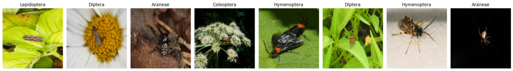
So here is a first try, comparing several machine learning methods, and evaluating the results in terms of accuracy and speed.
Continue reading “Real-time arthropod taxonomy”