Storing a taxonomic tree in a relational database

Taxonomic trees are ubiquitous in biodiversity software. A very common application is using a tree to allow the users to browse the data. Other applications are: training classification models, curating a collection, visualizing research results etc.

Data is often stored in a relational database, such as MySQL. Unfortunately, relational databases are not particularly well suited for storing tree structures. Yet the choice of a database may be guided by more important requirements, and so the taxonomic tree is sometimes implemented as an afterthought. The result can be a structure that is difficult to maintain and to query, sometimes requiring more work than expected to maintain and finally yielding a less satisfying experience for the end user.

I will show some counterexamples, and how get a better result by using a data structure called “nested set”.

Continue reading “Storing a taxonomic tree in a relational database”
Summarizing a text using topic modeling

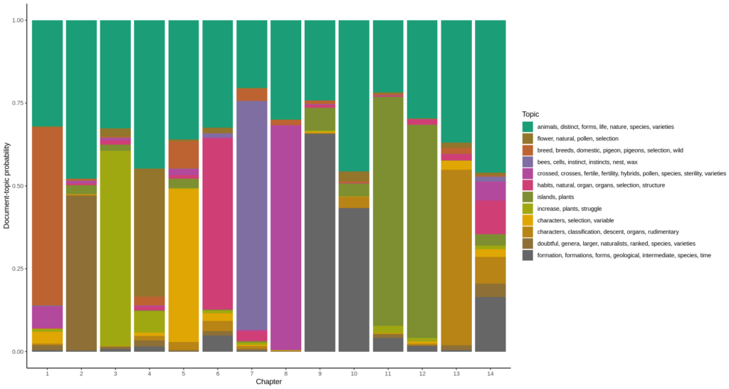
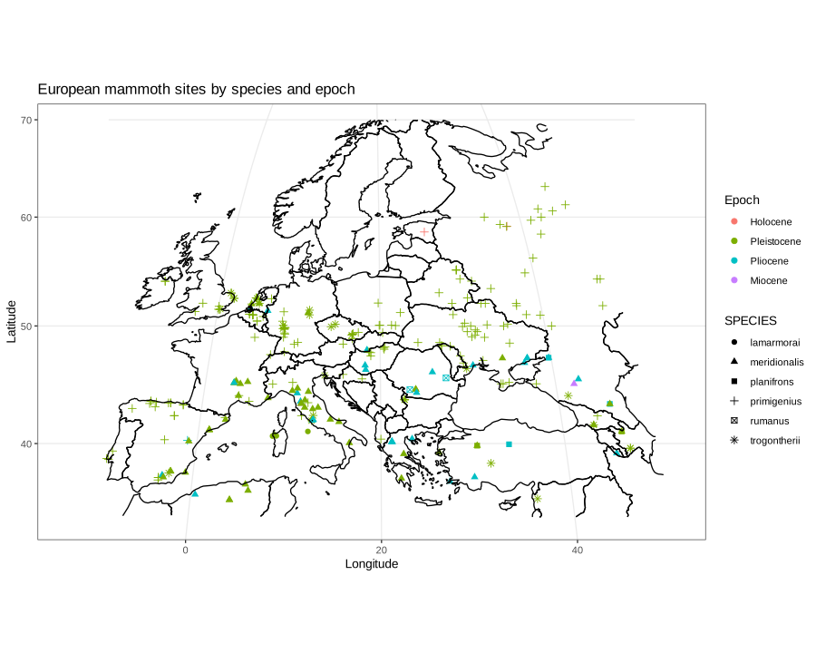
Much of biodiversity is discovered in museum collections, sometimes years after the specimen has been collected. Ploughing through expedition notes and logs is then required and therefore having a way to summarize the contents of a large text corpus can be very interesting. In this example, I will graphically summarize “On the Origin of Species” by Charles Darwin (it seemed a suitable choice) to demonstrate this technique.

Continue reading “Summarizing a text using topic modeling”

Comparing the distribution of Corvus corone and Corvus cornix

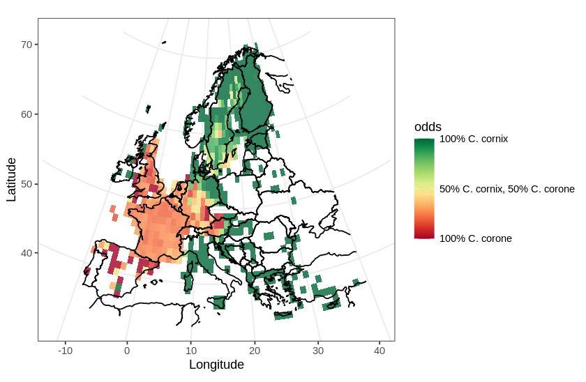
In this post, I will use a divergent color scale to plot two distributions on the same map. As an example, I chose to plot the European distribution of two species of corvids: the carrion crow (Corvus corone) and the hooded crow (Corvus cornix). There has been some adjustments to the taxonomical status of the hooded crow (see Parkin et al., 2003 for details), hoewever, currently, they are regarded as different species.

In this map, I will use a divergent color scale to show areas in Europe where each species is dominant, and also show areas where both species are present.

Distribution of Corvus corone and C. cornix in Europe
Continue reading “Comparing the distribution of Corvus corone and Corvus cornix

Simple distribution maps using ggplot

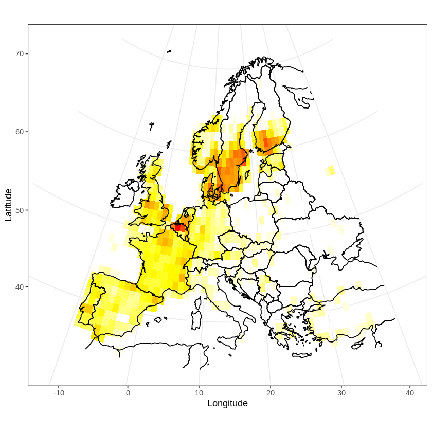
In a previous post, I discussed how to plot GBIF occurrence data using OpenStreetMaps. Here, I will plot a distribution map. Distribution maps differ from occurrence maps in that occurrences are aggregated and plotted as a heat map. Additionally, the map has to be projected using an equal area projection.
I will illustrate these two features by plotting the distribution of the tawny owl (Strix aluco) in Europe.

Distribution of the tawny owl in Europe
Continue reading “Simple distribution maps using ggplot”

Plotting GBIF occurrence data on a map using OpenStreetMap

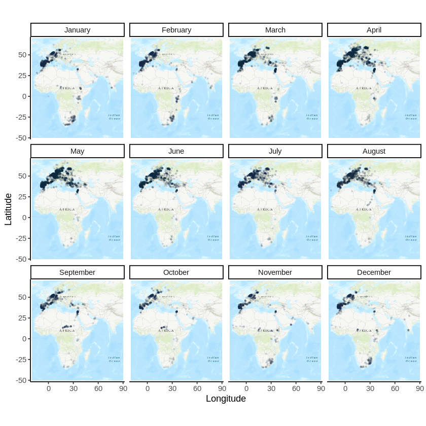
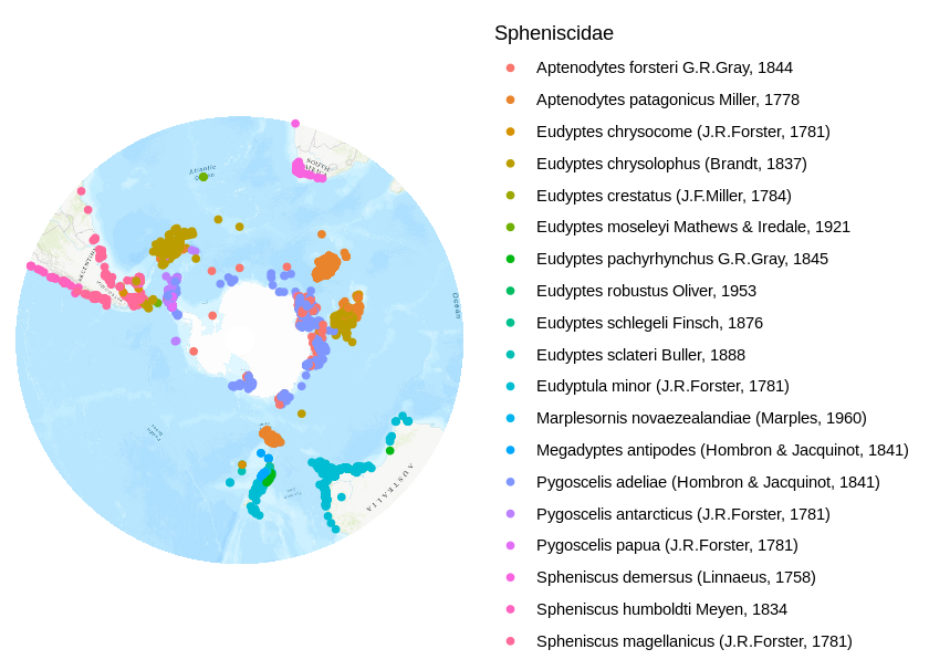
In a previous post, I dicussed how to get occurrence data from the Global Biodiversity Information Facility (GBIF). For my current project at the Natural History Museum in Berlin, I work on penguins. In this post, I will plot occurrences of penguin species on a map. Occurrence maps show the geographical position of occurrences.

The penguin map
Continue reading “Plotting GBIF occurrence data on a map using OpenStreetMap”

Spectrograms

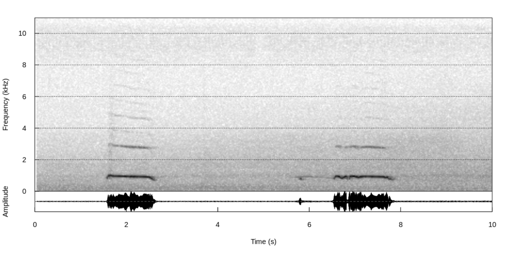
Spectrograms are a common visualization of sound data. Visualizing sound data can be useful when doing a presentation or for publication. Additionally, machine learning algorithms for classifying sound data generally use spectrograms as their starting point, instead of the sound data itself, as many advanced algorithnms for classifying images are readily available. The example uses the R packages warbleR (Araya-Salas & Smith-Vidaurre, 2017), seewave (Sueur, Aubin, Simonis, 2008) and tuneR (Ligges et al., 2018).

This example draws the spectrogram of the call of a tawny owl (Strix aluco).

Tawny owl (Strix aluco). Alvaro Ortiz Troncoso, XC494801. Accessible at www.xeno-canto.org/494801.
Continue reading “Spectrograms”