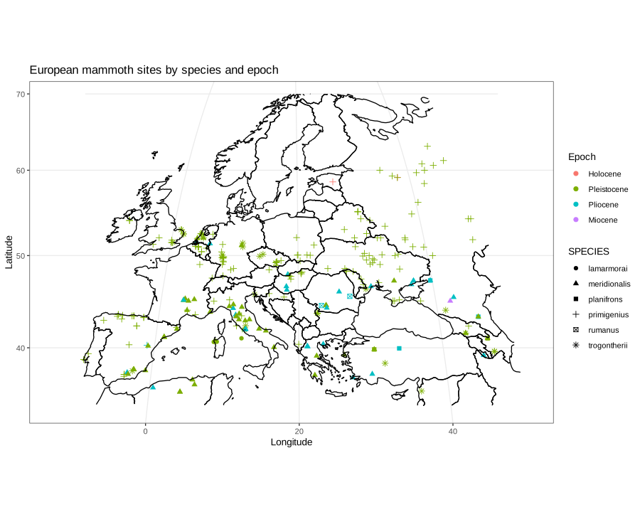
Paleontological data can be obtained from specialized online databases, and can be processed using specialized libraries. Here, I will use the NOW (New and Old World) database of fossil mammals to plot the distribution of mammoths in Europe and use the R library deeptime (Gearty, 2023) to clean up the data.
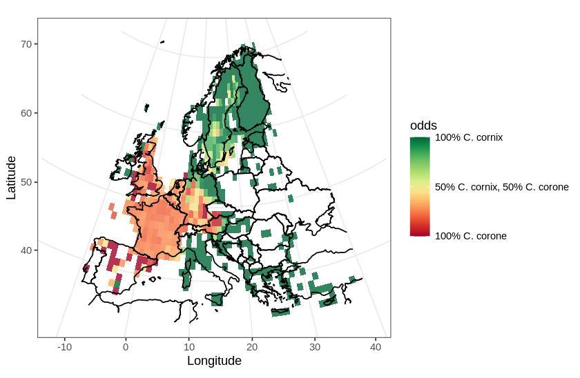
In this post, I will use a divergent color scale to plot two distributions on the same map. As an example, I chose to plot the European distribution of two species of corvids: the carrion crow (Corvus corone) and the hooded crow (Corvus cornix). There has been some adjustments to the taxonomical status of the hooded crow (see Parkin et al., 2003 for details), hoewever, currently, they are regarded as different species.
In this map, I will use a divergent color scale to show areas in Europe where each species is dominant, and also show areas where both species are present.
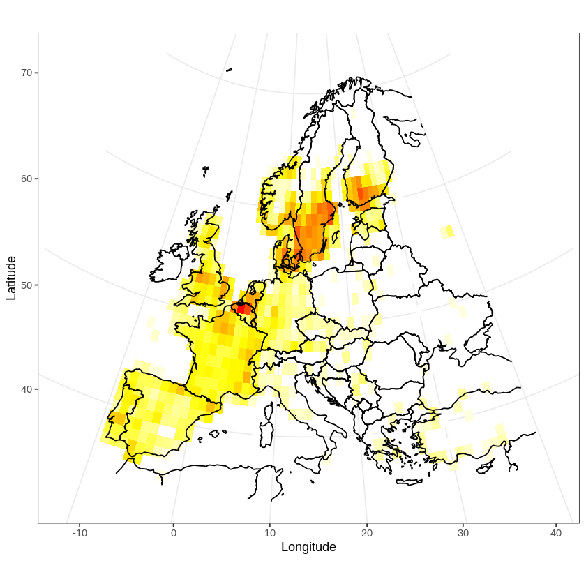
In a previous post, I discussed how to plot GBIF occurrence data using OpenStreetMaps. Here, I will plot a distribution map. Distribution maps differ from occurrence maps in that occurrences are aggregated and plotted as a heat map. Additionally, the map has to be projected using an equal area projection. I will illustrate these two features by plotting the distribution of the tawny owl (Strix aluco) in Europe.
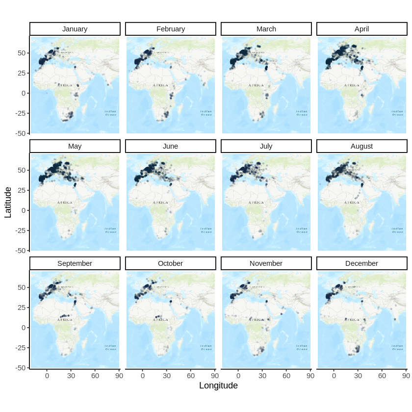
In a previous post, I discussed how to plot occurrence data from GBIF on a map. In this post, I will discuss how to plot a bird migration by producing an occurrence map for each month of the year. I will use the migration of the stork (Ciconia ciconia) as an example.