Computing α-diversity

Diversity indices are a common descriptive statistic used in biodiversity informatics. Diversity indices typically express the species richness of a given habitat or area. The α-diversity index is suitable when studying a single habitat and is expressed by a single number. There are several commonly used equations used to compute α-diversity. In this example, I will be using the Simpson’s diversity index, which is computed by the formula:

    \[D = 1 - \sum_{i=1}^{S}p_i^2\]

Where S is the number of species in the sample and p is the proportion of a particular species. The Simpson’s diversity index is thus more influenced by common species rather than by rare species and is often considered to be an index reflecting the actual species diversity in a sample.

To illustrate this, I will use will use data obtained from GBIF. Remember, α-diversity is suitable for expressing the diversity within a single habitat, so I will obtain data accordingly. Here I chose the Tiergarten, a large (210 hectare) park in central Berlin.

Continue reading “Computing α-diversity”
Comparing the distribution of Corvus corone and Corvus cornix

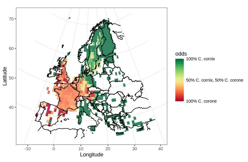
In this post, I will use a divergent color scale to plot two distributions on the same map. As an example, I chose to plot the European distribution of two species of corvids: the carrion crow (Corvus corone) and the hooded crow (Corvus cornix). There has been some adjustments to the taxonomical status of the hooded crow (see Parkin et al., 2003 for details), hoewever, currently, they are regarded as different species.

In this map, I will use a divergent color scale to show areas in Europe where each species is dominant, and also show areas where both species are present.

Distribution of Corvus corone and C. cornix in Europe
Continue reading “Comparing the distribution of Corvus corone and Corvus cornix

Simple distribution maps using ggplot

In a previous post, I discussed how to plot GBIF occurrence data using OpenStreetMaps. Here, I will plot a distribution map. Distribution maps differ from occurrence maps in that occurrences are aggregated and plotted as a heat map. Additionally, the map has to be projected using an equal area projection.
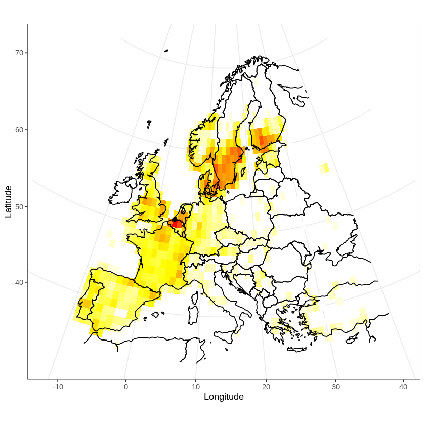
I will illustrate these two features by plotting the distribution of the tawny owl (Strix aluco) in Europe.

Distribution of the tawny owl in Europe
Continue reading “Simple distribution maps using ggplot”