For my capstone project in machine learning at EPFL, I wrote a classifier capable of sorting 3D scans of archaeological objects by culture.
Digitization of museum collections is currently a major challenge faced by cultural heritage and natural history museums. Museums are expected to digitize the collections to improve not only the documentation of artifacts, but also their availability for research, reconstruction and outreach activities, and to make these digital representations available online.
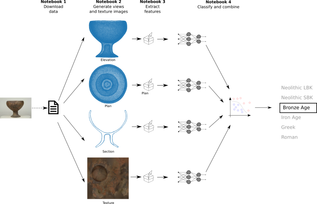
Machine learning setup
Continue reading “Using neural networks to classify 3D scans”