For a project on noise pollution in the oceans at the Natural History Museum in Berlin, I recently made this plot of the hearing and vocalization ranges of selected marine animals. Range plots are generally not-so-common plots. In this example, I plotted the hearing and vocalization range (frequency) for several species of whales, dolphins, seals, turtles and fishes.
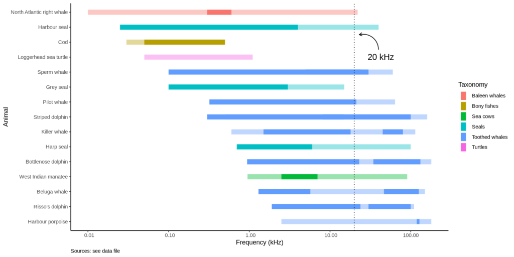
- Frequencies from 10 Hz to 100 kHz are on the x-axis, using a logarithmic scale. Note that range plots are by default vertical, so I had to flip the plot using coord_flip().
- Ranges are grouped by “taxonomy”
- Two ranges are overlaid: the transparent ranges represents underwater hearing abilities, the solid-colored range shows the frequencies at which specific animals vocalize underwater. Note that some vocalization ranges are split in two, as dolphins whistling and echolocation clicks are separate ranges.
- An annotation at 20 kHz shows the highest frequency a human could hear.
Now take a look at the harbor porpoise range: harbor porpoises are mute, they only emit echolocation clicks. See how high they are (>100 kHz), just above the hearing range of killer whales! So harbor porpoises can hear the killer whale coming, but the killer whale cannot hear them.
Here is the code:
# load libraries
library(ggplot2)
library(repr)

# read the data
url <- "https://gitlab.com/alvarosaurus/blog/-/raw/master/posts /data/marine_animals.csv?inline=false"
ranges_data <- read.csv(url)

# image aspect ratio
options(repr.plot.width=12, repr.plot.height=6)

# ranges, sorted by best hearing frequency, ascending
ranges_plot <- ggplot(ranges_data)

# full hearing ranges
ranges_plot <- ranges_plot +
    geom_linerange(
        size = 4,
        alpha=.4,
        aes(
            x=reorder(Animal, -hearing_min),
            ymin = hearing_min/1000,
            ymax = hearing_max/1000,
            color = Taxonomy))

# vocalization ranges
ranges_plot <- ranges_plot +
    geom_linerange(
        size = 4,
        aes(
            x=reorder(Animal, -hearing_min),
            ymin = voc_min/1000,
            ymax = voc_max/1000,
            color = Taxonomy))

# click ranges for dolphins
ranges_plot <- ranges_plot +
    geom_linerange(
        size = 4,
        aes(
            x=reorder(Animal, -hearing_min),
            ymin = clicks_min/1000,
            ymax = clicks_max/1000,
            color = Taxonomy))

# axes and labels
ranges_plot <- ranges_plot +
    scale_y_log10(
       labels = function(x) format(
          x, scientific = FALSE)) +
    labs(
        x="Animal",
        y="Frequency (kHz)",
        caption="Sources: see data file") +
    coord_flip()

# theme and caption
ranges_plot <- ranges_plot +
    theme_classic() +
    theme(plot.caption = element_text(hjust=0))

# annotations
ranges_plot <- ranges_plot +
    geom_hline(
       yintercept = 20, linetype=3) +
    annotate(
       "text",
       x=12, y=20,
       label="20 kHz",
       hjust=-0.5, size=5) +
    annotate("curve",
             x=12.5, y=40, xend=13.5, yend=23,
             arrow=arrow(length=unit(0.2, "cm")))

ranges_plot